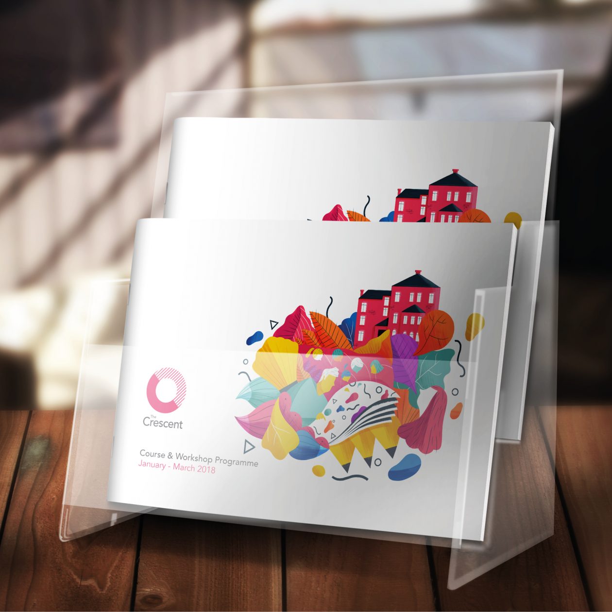
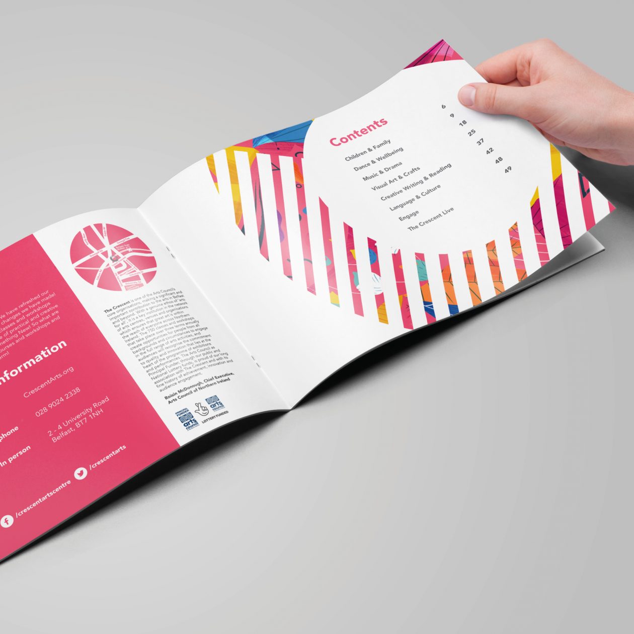
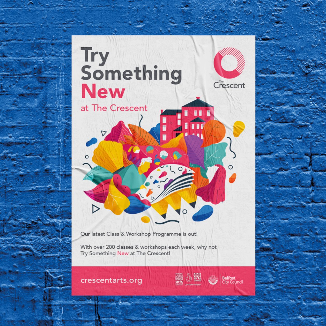
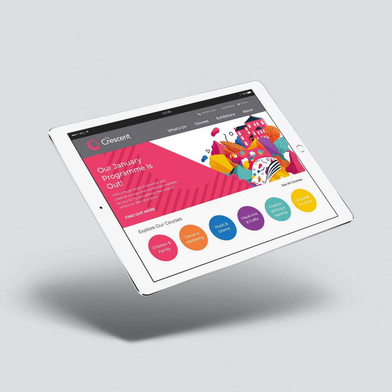
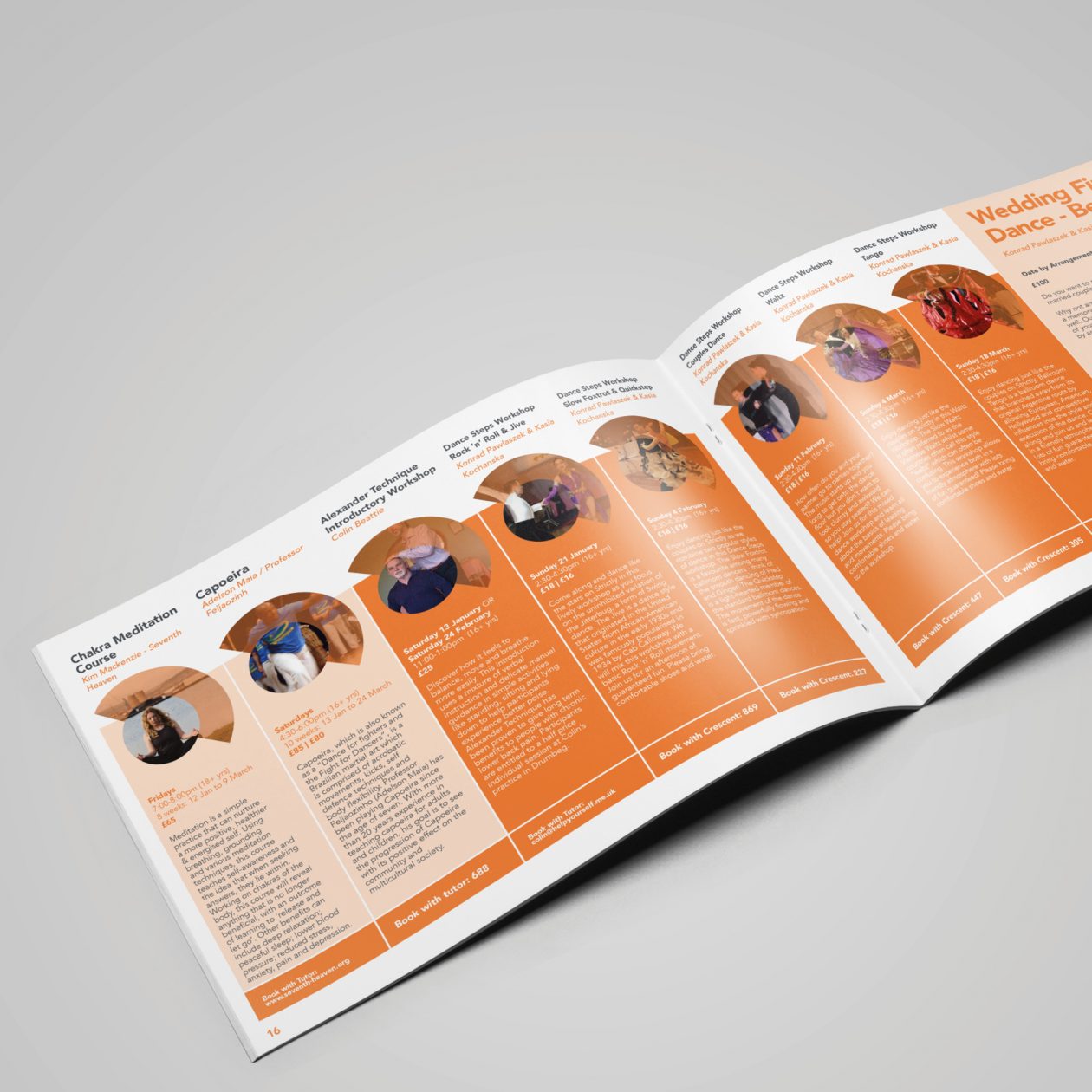
The Crescent Rebrand
Having previously teamed up with Belfast’s Crescent Arts Centre on a number of smaller projects, our design team was enticed by the opportunity to direct a rebrand for one the region’s most diverse and respected arts institutions, as they changed their name to The Crescent. This brand development was navigated by a need for universal simplicity, and with this in mind we explored potential visual cues and symbolism throughout the process of designing a new logo. This culminated in a logo design which strives to encompass some of what the Crescent represents; Openness, diversity, and a breaking away from the norm of one’s comfort zone to ‘Try Something New’ – as their strap line would put it – the logo’s visual nods to a crescent moon symbolising new beginnings. The logo design led the way throughout the rest of the rebrand, as we collated a palette of warm, affable colours in the development of a series of easily identifiable, user-friendly sub-brands, which could function effortlessly across web and print.